Showing posts with label design. Show all posts

Friday, September 21, 2012

Barbicide Q&A | Doug Sharf


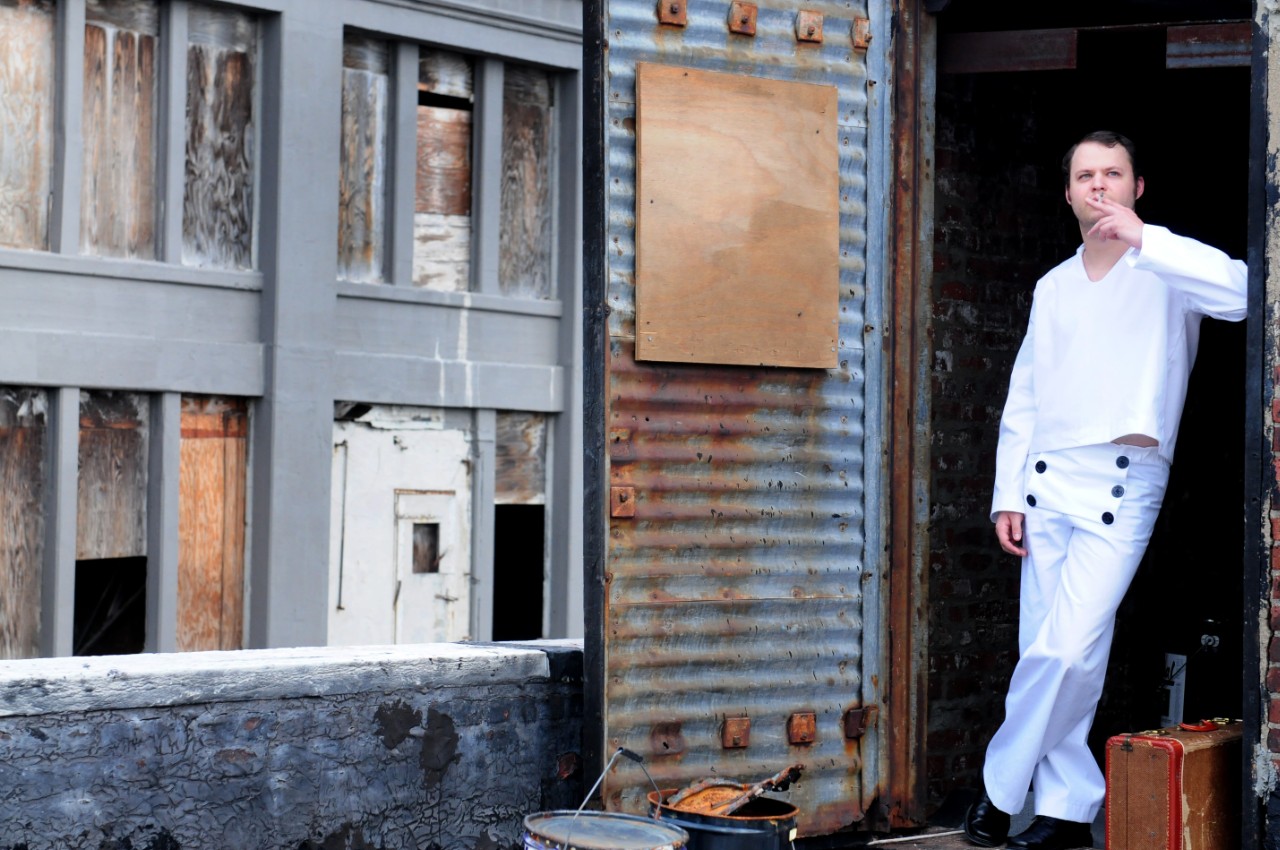
Doug Sharf portrays Ant Knee in Barbicide.
Doug Sharf, who plays Ant Knee and Toby in Barbicide,
sat down with us for a brief Q&A:


What are your characters all about?

"One of my characters, Ant Knee, is plagued with the common problem of beginning a new life after the armed forces with pretty much nothing.  The sailor boy just drifts along until he finds something worth living for: Jo.  Once he meets her, she's what he's all about.  He's not a people person and chasing a peaceful, domestic life with Jo becomes everything.  My other character, Toby, is all about eating and figuring out what happened to his role model, Joey Fanta."

Without giving anything away, What is your favorite moment in Barbicide?

"When Toddesco competes in the Shave Off."

What is the biggest discovery you have made during this production?

"Never go full retard."

 What has been one of your most memorable moments working on this piece?

"This dates back to when we started the reading series at the Moustache Tonsorial--the barber shop in the Village.  The first reading packed the place.  It was hot, there was alcohol and we had no idea how the play would be received. But it got a really strong response.  As we read through the play that night, I remember beginning to trust the words more and more because of the connection they were forming with everyone."

What is your favorite drink?

"It was Tanq+Tonic but I'm starting to just drink whiskey on the rocks. And always Guinness."

What is your favorite food?

"Pizza. From the $1 slices to the places that won't even serve just slices."

What is your current obsession?

"Writing a good script."

If you could give up one of your vices, what would it be?

"Envy, definitely. It's ugly and indicative of inner turmoil." 

What is one thing you waste too much money on?

"Food. I need to do more grocery shopping."

What is one activity you waste too much time doing?

"Fantasy Football research and watching football."

What in the world most thrills you?

"The world. Mostly travelling it. Seeing things that most other people don't get to see. Doing the more secretive stuff that the locals are into, not the tourist traps."

What is your personal motto?

"Well, my quote in my senior yearbook was from Ferris Bueller's Day Off, it was 'Life moves pretty fast.  If you don't stop and look around once in a while, you could miss it.'  I think that still applies.  It's either that or 'Never eat airport Chinese food before a flight to Puerto Rico.'"

Thursday, September 13, 2012

Barbicide Q&A | Paulette Oliva


Paulette Oliva portrays Ms. Lionetti in Barbicide
Paulette Oliva, who plays Ms. Lionetti and the Beggar Woman in Barbicide
sat down with us for a brief Q&A:


What is your character all about? 

Mrs. Lionetti, is teetering on the verge of being an "old maid" - or more appropriately in Italian -"zitella".  From a very young age - she was either babysitting for her "slow" younger brother, or working alongside her parents at their restaurant. Never married, and plodding through her dull and hapless life, she survives by operating a pizza parlor -  controlled primarily by the mob.  She escapes from her troubles at the movies, or with soap operas.  Her social life consists of driving distant aging relatives to the beauty salon.  Alone in the world, and resigned to her lot in life - things begin to spice up a bit, when a mysterious stranger enters her pizza shop.  Desparate for companionship, she concocts a storied version of past events to suit her situation.  Things begin to unravel quickly....”

Without giving anything away, What is your favorite moment in Barbicide?  

“The shave-off!”

What is the biggest discovery you have made during this production? 

With limited space, and functional props only - I am amazed how this play truly relies on the actors' ability to breathe life into every moment of this piece - to the point where an audience will not feel the least bit "under-served" in terms of production values - quite the opposite...the words seem richer, the moments are more profound, and the audience is more engaged.  The magic of theatre - period.”

What has been one of your most memorable moments working on this piece?  

I have a feeling it is yet to come.... because every time I think a moment is memorable, it gets trumped by the NEXT memorable moment.... it's about the process for me, the journey....and the collection of many memorable moments.”

What is your favorite drink? 
Grey Goose Vodka...on the rocks, no fruit, olives, or other distractions.......”

What is your favorite food? 

Potato Chips (is that a food group?)”

What is your current obsession? 

Driving with the top down.  Um, that would be my CAR top down.”

If you could give up one of your vices, what would it be?  

“I don't smoke or gamble - and Vodka's not a vice, YET.  Did I mention Potato Chips??”

What is one thing you waste too much money on? 

“Coffee at Dunkin.”

What is one activity you waste too much time doing? 

I get lost in Tumblr and Pinterest.........”

What in the world most thrills you? 

Singing "Rose's Turn" to a sold out audience.”

What is your personal motto?  

Don't wait - do it now - life is too short.”


Wednesday, February 22, 2012

From The Director's Notebook v.5: Branding


Developing The Brand
Building Imagery for a Production


2. 21. 2012, 4:00PM


One of my favorite pre-production projects  is creating the identity of the play I am currently working on. Some may see this a rather daunting task, for myself however, it is how I begin to give the production direction. Recently, I completed the imagery that will be used for The Theatre Project's upcoming reading of Barbicide. I thought it may be interesting to share the process that lead to the final key art that we shall be using.


When I begin to create a icon or poster for theatre, I consider all aspects. The play's setting, language, and scenic design highly influence my initial design concepts. The play may not be completely designed, and very rarely have I balanced key art when staging, but by creating this identity I can rein in all aspects.


Barbicide is a highly stylized play that hybrids beat poetry, monologues and dialogue. Linguistically it is very unique, which is why we decided to present the piece as a developmental reading prior to staging it. Additionally the play is set at the height of the 1964 World's Fair in Flushing Meadows, Queens. We see a lot of elements that will translate into the production from the time period. Even more important is the main character, Toddesco. Having been framed and imprisoned in the 1940's, and later being released in the 60s, Toddesco encounters a variety of changes to culture. All these details become a part of the knowledge incorporated into the design.
The Vanishing American Barber Shop
by Ronald S. Barlow


It was crucial that the vintage quality stay at the forefront of the piece. Both Sean Pomposello, playwright of Barbicide, and I wanted to include that dated charm. The homey quality of a barber shop has been very necessary to understand in order to develop the ideal look. I have been using a wonderful study on the tonsorial arts that really hits the nail on the head for every department. "The Vanishing American Barber Shop" has ended up becoming the dramaturg to our production. Included is the history of the tonsorial arts, old school photography, detailed product catalogs and illustrations, as well as scenic, prop and wardrobe cues. I even investigated various throwback salons in Manhattan to develop an idea of the environment we would be set in. My favorite, without any doubts, was Moustache Tonsorial. It also was important to consider that Toddesco's environment would lean more towards his past as opposed to his present, both stylistically and emotionally.


Initially, I began with a rough place-holder graphic, with the understanding that the graphic was sure to be improved upon over the course of the pre-production phase. Heavily leaning towards the more noir aspects of the production, the first try ended up being this:
First Try
I really liked the imagery. A straight razor sums the piece up perfectly while the typography calls toward a film noir style. Combining serif and sans-serif fonts was an idea that I ended up liking as well, especially for the main reason that it was done in a subtle and unobtrusive manner. The adjacent graphic did not manage to convey the play as well as I had hoped for, which led me to go a bit more vintage.


By approaching the art through a vintage approach, I opened the production up to more options scenically. Not many will use this approach, but I favor cohesion through all elements.


Second Try
The dog eared paper look in the second try really pleased me aesthetically. Additionally, the font choice felt very appropriate considering the time period that Barbicide spans.


After making these two posters, I noticed something that truly excited me. The similarity between the letter A and the straight razor was too good to pass up. Using the razor in a typographical manner had the potential to allow the show to speak for itself in a new way.


And so, I decided to do a little bit of playing around which led me me to the following piece of art work:


By combing the font from the second try with the black of the first, I was able to connect both Noir and vintage into one. And the A/razor concept ended up working out well.


Third Try

I could not help feeling that the black was too dark. Yet I did not want to lose the noir concept. I considered how that concept would be maintained through the typography as well as through staging. I then allowed myself to take what I liked out of all the concepts and fuse them together. This left me with our final product:

Fourth & Final Try
Keep in mind, that this imagery is simply for our upcoming reading. For our run this summer, we will go through this process all over again.

I must say, that the fourth try completely captures the production accurately, especially to present a reading. When it comes time for our full staging, we will have a new poster designed. Simplicity works well for a reading, but a full production's key art needs a bit more pop.


-Christian Amato